
Designing a small logo for webbing sounds simple—until the sample comes back thicker, blurred, or missing details.
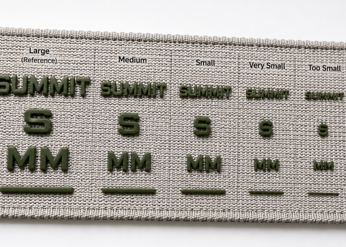
For silicone printing on webbing, logos usually need at least 0.6–0.8 mm line thickness and 0.4–0.6 mm spacing to stay readable. You can go smaller, but this is where we start seeing gaps close, edges soften, and details merge—especially on textured or wider webbing.
If your logo is being scaled down, don’t rely on artwork alone. Below is where small silicone logos actually start failing—and what to adjust before you approve sampling or move into production.

Webbing manufacturing expert with 15+ years of experience helping product developers build high-performance straps for industrial, medical, and outdoor use.
For silicone printing on webbing, keep the final logo at a size that maintains at least 0.6–0.8 mm line thickness and 0.4–0.6 mm spacing. From our manufacturing experience, this is the practical range where small logo details can still remain clear and repeatable. The actual overall logo size will therefore change with the artwork and the available printing area on the webbing.
For example, a logo placed on 20 mm webbing may need to fit within a much smaller height than the same logo used on 40 mm webbing. If reducing the logo to fit the 20 mm width changes a 0.8 mm stroke to 0.5 mm or reduces a 0.6 mm gap to 0.3 mm, the design has moved outside our normal working range. A simple logo with thicker strokes may still work at that overall size, while a detailed logo with small letters, outlines, or internal gaps may not.
This is why we evaluate the final-size artwork together with the actual webbing width, rather than approving a logo from its overall dimensions alone. The smallest strokes and gaps usually reveal the problem first: gaps begin to close, separate elements start to merge, or edges become softer than the original artwork.
If the scaled artwork falls below the workable range, increase the logo size first while keeping enough clearance from the webbing edges. If the available width does not allow a larger logo, adjust the artwork instead—thicken the limiting strokes, open tight gaps, or remove secondary fine details. If those changes alter an important part of the brand design, don’t keep simplifying it just to make silicone printing work. Keep the original artwork larger, use a wider webbing where the product allows it, or evaluate another logo method that can better reproduce the required detail.
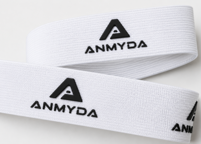
For stable silicone printing across different webbing widths, we normally recommend keeping 0.8–1.0 mm line thickness and at least 0.6 mm spacing in the final-size artwork. From our manufacturing experience, this gives more production margin than working close to the minimum printable range of 0.6–0.8 mm lines and 0.4–0.6 mm gaps.
This matters when the same logo is used across different webbing widths. For example, artwork developed for 40 mm webbing may need to be reduced to fit 25 mm webbing. If a 1.0 mm stroke becomes 0.7 mm after scaling, or a 0.7 mm internal gap becomes 0.5 mm, the logo may still be printable, but it has moved out of the safer range. Fine details then have less tolerance for differences in webbing surface, silicone flow, ink deposit, and screen setup.
The narrower webbing is not itself making the silicone less printable. The problem is that the smaller available printing area forces the artwork to shrink. This is why one logo that runs comfortably on 40 mm webbing can become much more sensitive when adapted to 25 mm webbing.
For applications using several webbing widths, prepare the logo at its final size for each width and protect the 0.8–1.0 mm line and 0.6 mm spacing range wherever possible. If the narrowest webbing pushes important features below that range, increase the available logo size first. If there is not enough width, selectively thicken fine strokes, open tight gaps, or simplify secondary details while keeping the approved logo proportions. When those changes would noticeably alter the brand design, use an approved width-specific logo version rather than forcing the same artwork to scale proportionally across every webbing width.
Send us your logo and webbing width—we’ll check whether the details are ready for sampling.
Webbing width affects how small a silicone logo needs to be because it determines the space available for the artwork. A logo that fits easily on 40 mm webbing may need to be reduced for 20 or 25 mm webbing, and that reduction can push its smallest details closer to the printing limit.
The full webbing width is not normally available for the logo. Some space is needed between the artwork and the webbing edges, so a 20 mm webbing does not mean you can simply use a 20 mm-high logo. The shape of the logo matters too. A wide, low wordmark may fit narrow webbing without much reduction, while a taller emblem or stacked logo may need to be considerably smaller on the same width.
This is where width starts affecting printability indirectly. As the artwork is reduced to fit the available area, its letters, outlines, gaps, and cutouts reduce with it. A logo can therefore fit the webbing visually while some of its details have already become too fine for a clean silicone print.
When choosing the logo size, start with the usable print area on the actual webbing width, then scale the complete artwork into that space. If important details become too fine, use more of the available print area before changing the design itself. If there is no more room, thicken the limiting strokes, open tight gaps, or simplify secondary details. When the logo cannot be reduced enough without changing its approved appearance, the better option is to use a width-specific artwork version rather than forcing the same logo size onto every webbing width.
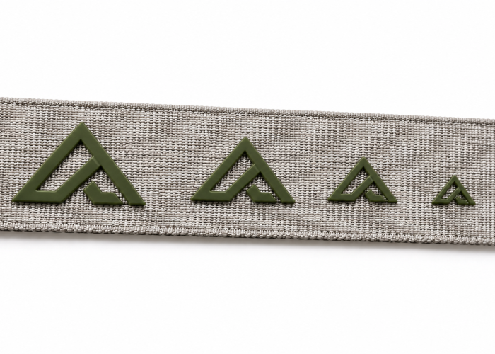
For small text and fine details, we normally keep critical strokes at 0.6–0.8 mm or above and spacing at 0.4–0.6 mm or above in the final-size artwork. Below this range, small letters, thin outlines, narrow openings, and closely spaced details become more difficult to reproduce clearly.
Small text often reaches the limit before the overall logo does. For example, the main letters of a wordmark may still have enough stroke thickness, while a smaller tagline underneath contains much thinner strokes and tighter spaces. The same problem occurs with the centre of letters such as “A”, “B” or “R”, fine outlines around a symbol, and small cutouts inside an emblem. The logo may look perfectly clear on screen, but those individual features are what the silicone printing process actually has to reproduce.
The webbing surface and printing setup also matter more as these features become finer. A design comfortably above the minimum range has more room to tolerate these differences. A detail already close to the limit has much less margin, so small openings or separate elements are usually the first areas where clarity is lost.
If only a few details are causing the problem, adjust those features instead of enlarging or redesigning the whole logo. Thicken the affected strokes, open small letter spaces or internal gaps, or remove a fine outline that is not essential to the design. If the detail is important to the brand and cannot be changed, increase the overall logo size instead. If the available webbing width does not allow that, consider a different logo method rather than continuing to simplify an important part of the artwork.
Share your artwork and webbing specs—we’ll identify what needs adjusting without changing more than necessary.
Fine lines and small gaps close up because the artwork becomes smaller while the silicone still needs enough physical space to reproduce each positive line and negative opening. The closer these features are to the printing limit, the easier it is for separate details to lose their intended shape.
This is especially noticeable in logos with outlined letters, narrow cutouts, or small spaces between two elements. Imagine an internal gap that measures 0.8 mm in the original print size. If the complete logo is reduced by 50%, that gap becomes only 0.4 mm. The same reduction also turns a 1.2 mm line into a 0.6 mm line. The logo still has the same proportions on the artwork, but the silicone now has much less room to reproduce those features separately.
The printed result tells you which feature has reached its limit. A negative gap normally starts looking narrower or partially filled, while two nearby elements may begin to look connected. A very fine positive line can behave differently—it may lose definition rather than simply becoming heavier. This distinction matters because the two problems should not automatically receive the same adjustment.
If a gap is closing, open that negative space first; if a fine line is losing definition, increase that stroke instead. Don’t enlarge or redraw the entire logo when only one feature is limiting the design. After adjustment, check the artwork again at its final print size. If keeping every detail requires the logo to become too large for the available webbing area, simplify the non-essential detail. If that detail is part of the brand identity and cannot be changed, stop reducing the logo and use a larger print area or a more suitable branding method.
When a silicone logo is too small for the selected webbing width, fine strokes can lose definition, small gaps can close, and separate details can begin to merge. The logo may still be printable, but reducing it to fit the available area has pushed important features below a workable size.
For example, a detailed emblem may look balanced on 40 mm webbing but require substantial reduction to fit 20 mm webbing. After scaling, the main shape may still be recognisable, while a thin border, small lettering, or internal cutout becomes difficult to reproduce. This is different from a simple wordmark on the same 20 mm webbing, which may remain clear because its important features are thicker and more open.
This gives the buyer a useful diagnostic boundary: if the complete logo looks small but all details remain clear, that is mainly a visual or branding decision—not a silicone-printing defect. It becomes a manufacturing problem when the required size causes important strokes, gaps, or details to fall outside the workable printing range.
When that happens, first use as much of the available print area as the product design allows. If the logo still cannot be large enough, adjust only the features causing the printing problem—open tight gaps, strengthen fine strokes, or remove secondary details. If these changes noticeably alter the approved brand appearance, don’t keep simplifying the logo to make it fit. Use a width-specific logo version, reconsider the available webbing width if the product design allows it, or choose another branding method better suited to the required detail.
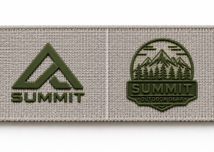
Yes. A pronounced webbing texture can require a larger or simpler silicone logo because fine details have to print across an uneven woven surface. Thickness can also matter, but surface structure is usually more useful than thickness alone when judging minimum logo size.
Compare a tightly woven webbing with a relatively flat face to one with obvious ribs, raised yarns, or deeper gaps between yarns. On the flatter surface, a small silicone line has a more uniform base underneath it. On a pronounced texture, the same line may cross both raised yarns and lower areas. As the feature becomes finer, those surface differences take up a larger proportion of the printed detail, so edges can look less even or very small areas may lose definition.
This is why two webbings with the same 2 mm thickness do not necessarily support the same minimum logo detail. One may have a compact, relatively smooth face, while the other gets much of its thickness from a more pronounced construction. Looking only at the thickness specification can therefore lead to the wrong conclusion.
If a small logo loses clarity on one webbing but prints clearly at the same size on a smoother reference, check the surface construction before increasing the entire logo. First test whether slightly thicker strokes, more open gaps, or fewer secondary details can give the design enough tolerance for that surface. If the fine detail is essential and these changes would alter the brand appearance, test a larger logo. If neither the available webbing width nor the approved design allows that adjustment, consider a smoother webbing construction where the product requirements permit it, or a branding method better suited to the required detail.
Seeing variation between samples? We’ll help check the logo before you approve bulk production.
On narrow webbing, a small silicone logo is generally easier to keep clear when it sits within a stable printable area rather than very close to the edge. Edge placement leaves less clearance for the logo and less tolerance for normal positioning variation, especially when the artwork already uses most of the available webbing width.
For example, a logo centred on 20 mm webbing can use the available space more evenly on both sides. Move the same logo toward one edge and the clearance on that side becomes much smaller. If the logo is already relatively large for the 20 mm width, even a small positioning shift becomes much more noticeable because there is little space left between the artwork and the edge.
The important distinction is placement accuracy versus print clarity. If the complete logo remains sharp but its distance from the edge varies between samples, the problem is mainly positioning tolerance. If fine details themselves start losing definition, then the logo size, available print area, and printing conditions also need to be checked. Moving a logo closer to the edge does not automatically make silicone details less printable.
If the design must sit close to an edge, set the required position and acceptable placement tolerance before sampling, then compare several samples rather than approving one ideal piece. If the edge clearance is too sensitive to normal positioning variation, move the complete logo inward first. If the brand position is fixed, reduce the complete logo slightly to create more clearance. But if reducing it pushes the strokes or gaps below the workable printing range, don’t keep shrinking it. At that point, the placement requirement and minimum printable logo size are conflicting, so use an approved placement-specific artwork version or consider another branding method.
A small silicone logo can look clean in samples but become less consistent in production when its finest details are already close to the workable printing limit. A good sample proves the logo can be printed, but it does not always prove that the same detail has enough margin to remain consistent throughout production.
For example, a fine stroke or small gap close to our minimum working range may reproduce clearly during sampling. But because there is little margin left, differences in silicone deposit, screen setup, or the webbing surface can become more visible in those details. A design with stronger strokes and more open spacing has more room before the same process differences noticeably change its appearance.
The warning sign is repeatability between samples, not simply whether one sample looks good. If the same small gap stays open on one piece but becomes noticeably narrower on another, or a fine feature changes definition between pieces, that detail needs attention before production. If the logo remains equally clear but only its position changes, that is more likely a placement-tolerance issue rather than evidence that the artwork itself is too fine.
Before approval, compare several prints made on the intended production webbing and identify the smallest brand-critical features that must remain consistent. If those features already vary, create more margin by opening the affected gaps, strengthening fine strokes, or increasing the logo size where space allows. Once the result is stable, keep an approved sample or agreed visual reference showing the acceptable logo appearance. Bulk production can then be checked against that approved result instead of relying on one successful sample as proof that every borderline detail is production-safe.
A small silicone logo should be redesigned by changing the details that reach the printing limit first, rather than simply enlarging or simplifying the whole logo. Keep the main brand shape and proportions wherever possible, then give the smallest strokes, gaps, text, and cutouts enough space to reproduce clearly.
For example, if a wordmark has strong main letters but a thin outline around them is causing the problem, removing or strengthening that outline may be enough. If a small internal opening is closing, enlarge that opening without changing the complete logo unnecessarily. A secondary tagline can also reach the printing limit before the main logo; in that case, increasing its stroke weight, opening its letter spacing, or removing it from the smallest logo version may preserve the main brand identity better than enlarging everything.
The redesign should respond to what is actually limiting the logo. A single fine feature does not justify redesigning the entire artwork. If several important features become too fine only after the logo is reduced to fit narrower webbing, however, repeatedly adjusting individual details may no longer be the right solution. At that point, the available print area—not one isolated feature—is limiting the design.
Start with the least disruptive change: correct the individual limiting feature, then check the complete artwork again at its final print size. If several important features still fall below the workable range, increase the overall logo size. If the available webbing width prevents that, create an approved simplified version for the smaller application. When the details that would need to be removed are essential to the brand identity, stop simplifying the artwork and consider a different branding method instead.
Fine logo details do not become reliable simply because one screen-printed sample looks good. What matters is whether the smallest important lines, gaps, and text have enough margin to stay clear across the actual webbing, production samples, and required use conditions.
If your logo is already losing detail during sampling, send us the artwork and webbing requirements. We can help evaluate what should change before you redesign the whole logo or switch printing methods.
We will contact you within 1 working day, please pay attention to the email with the suffix “@anmyda.com”.