
When preparing artwork for a custom sports bra strap at the RFQ or early sampling stage, a developer may already know the strap width and desired logo size but still need to confirm whether the logo can be reproduced clearly by jacquard weaving.
Small logos can be woven clearly into sports bra straps when the scaled artwork keeps enough definition in its thinnest strokes, smallest gaps, and lettering for the jacquard construction to reproduce them. On a 30 mm sports bra strap, for example, a 5–8 mm-high simple logo with clear shapes or medium-to-bold lettering can generally be practical, while thin strokes, tight gaps, or tiny secondary text at the same size may lose definition.
This article explains what to check in small logo artwork, how strap width and stretch affect woven clarity, and when the artwork should be adjusted before sampling.

Webbing manufacturing expert with 15+ years of experience helping product developers build high-performance straps for industrial, medical, and outdoor use.
A wider sports bra strap gives a woven logo more vertical space, so the artwork can stay larger and retain more of its original detail. On a narrower strap, the same logo usually has to be scaled down, which makes small lettering, thin strokes, and tight gaps reach the woven-detail limit sooner.
This is why the strap width should come from the sports bra design first. If the product requires a 30 mm strap, for example, the logo should be placed at its intended finished size within that 30 mm width before its woven clarity is judged. A simple wordmark may still have plenty of room, while a logo containing small secondary text or fine lines can lose definition even though the overall logo fits comfortably inside the strap.
Fitting the logo inside the strap and reproducing its details clearly are therefore two different checks. Published woven-label guidance also shows that small lettering and fine details have their own practical limits, independent of whether the overall artwork physically fits the available space.
For development, keep the strap width required by the sports bra and evaluate the actual logo within that space. If important details become too small at the intended logo size, keep the required strap width and treat the artwork as the next development decision rather than widening an already-suitable strap simply to make the logo easier to weave.
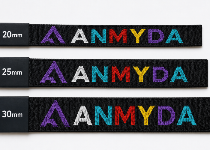
For small woven logos, about 1.5–3 mm in letter height is a useful published reference range, while fine artwork details around 0.25 mm already require closer attention. Simple lettering can work toward the smaller end, while script, thin strokes, tight spacing, or more detailed artwork generally needs more room to remain recognizable. Published supplier limits vary, which is why these figures should be used for initial artwork screening rather than treated as universal limits for elastic jacquard straps.
These measurements refer to the features inside the logo, not the overall logo height. A 6 mm-high wordmark with bold, open lettering can therefore be easier to reproduce than an 8 mm-high logo containing tiny secondary text or fine internal details. For our 30 mm sports bra strap example, a simple 5–8 mm-high wordmark gives enough room to start evaluating the artwork, but the smallest features inside it still determine whether that size is suitable for sampling.
Use the feature dimensions as a screening check before sampling. If the smallest lettering and important details stay comfortably above the supplier’s working range, keep the intended logo size and confirm it with the woven sample. If important features approach or fall below that range, don’t assume the logo will be clear just because it fits the strap. Identify those features first and decide which matters more for the product: keeping the logo at the intended small size or preserving those design details. The manufacturer can then develop the sample around that priority.
Send your artwork with the intended strap width and logo size. We’ll check the small details before you sampling.
Simple wordmarks, solid symbols, and logos with clear spacing work better at small woven sizes than artwork with thin lines, tiny text, narrow gaps, or complex internal details. The fewer small features that need to remain separated in the weave, the easier it is to keep the logo recognizable after it is reduced to the required sports bra strap size.
A short brand name in medium-to-bold sans-serif lettering, for example, can generally be reduced further than the same name in a thin serif or script style. A solid symbol also gives the weave larger areas to define, while an icon with several fine outlines, small cutouts, or closely spaced elements can start losing those distinctions sooner. Published woven-label guidance similarly favors clean shapes, open spacing, and fewer fine details for small woven artwork.
For combination logos, the whole artwork does not necessarily become unsuitable because one part is too small. The main symbol or wordmark may reproduce clearly while a tagline, narrow gap, or secondary detail does not. During artwork review, those elements should be evaluated separately so the first sample tests the features that actually matter to the brand rather than treating every detail as equally important.
Before sampling, scale the artwork to its intended finished size and identify the smallest features that must remain recognizable. If the main wordmark or symbol still reads clearly but a secondary element becomes too small, flag that element instead of automatically enlarging or rejecting the entire logo. Give the manufacturer a clear priority for what must be preserved in the first woven sample.
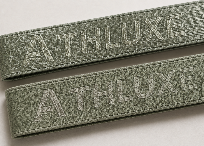
Higher contrast between the logo and background makes small woven lettering, edges, and gaps easier to distinguish, while low contrast can make the same woven details appear less clear. As the logo becomes smaller, this visual separation matters more because each letter and shape already has less space to remain recognizable.
This does not mean choosing any two different colors will improve clarity. A small logo can still blend into the strap when the logo and background have similar lightness, even if their hues are different. Stronger light-dark contrast generally creates a clearer visual boundary, but color cannot restore a line or gap that the woven construction failed to reproduce.
When a small logo looks unclear on the first sample, check whether its edges, gaps, and letter shapes are physically present before changing the artwork. If those features are woven correctly but visually blend into the background, the next sample can keep the same logo size and construction while testing stronger color contrast. If the features themselves have merged or disappeared, changing yarn color is the wrong adjustment because the problem is in the reproduced detail, not its visibility.
If the required details are present but difficult to distinguish, keep the logo size and construction unchanged and test a higher-contrast color combination. If the details have physically merged or disappeared, keep color out of the next adjustment and return to logo size or artwork detail instead. Change one cause at a time so the next sample shows what actually improved the result.
Let us review the lettering, gaps, and fine details at the size you actually want on the strap.
Making a small logo larger helps when letters, strokes, or gaps have become too small to stay separate in the weave. It does not solve every clarity problem. If the woven details are already there but the logo is difficult to see because of low color contrast, increasing the size is solving the wrong problem.
When a sample comes back unclear, making the whole logo larger should not be the first adjustment. Check what actually became unclear. If two letters have started joining together, a small opening has closed, or a thin line has disappeared, giving those features more space may improve the next sample. If the letters and lines are still formed correctly but visually blend into the strap, keep the size and look at the logo/background contrast instead.
There is also a point where making the logo larger stops being useful. A bigger version may be easier to weave, but it can take up more of the strap than the developer originally wanted. Once the important details are clear, increasing the size again adds little manufacturing benefit and starts changing the intended branding proportion.
Compare the sample with the original artwork and identify what actually disappeared or merged. If important details need more space, trial a larger logo while keeping the strap width and other approved requirements unchanged. If the details are already present, keep the intended logo size and address the actual cause instead. Stop increasing the size once the important features reproduce clearly.
Small woven logos can keep their key design details by protecting the parts that make the logo recognizable and giving more flexibility to minor details that become unclear at the intended size. The goal is not to simplify the whole logo just because one small feature is difficult to reproduce.
If a developer wants to keep the logo small, first identify which parts of the artwork must still show clearly. Usually that means the brand name, main symbol, or a distinctive part of the logo. Small taglines, very fine outlines, narrow gaps, or minor decorative details may have more room for adjustment if they start disappearing when the artwork is scaled down.
The first woven sample makes that decision much easier. If the main logo still looks right but one small secondary detail is unclear, that detail can be reviewed without making the whole logo larger. But if the part disappearing is what makes the logo recognizable, simplifying it just to keep the logo small is usually the wrong trade-off. In that case, the logo needs more room.
Before sampling, tell the manufacturer which parts of the logo must remain unchanged. If only secondary details become unclear, keep the intended logo size and review those details for the next sample. If an essential letter, shape, or symbol cannot reproduce clearly, keep that feature and test a larger logo instead of removing the part that gives the logo its identity.
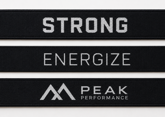
Stretching will change how a small woven logo looks because the logo stretches together with the sports bra strap. Small letters, narrow gaps, and fine shapes usually show this change first, while a simple, bolder logo has more room to stay recognizable.
So don’t judge the logo only with the sample lying flat. Check the same logo with the strap relaxed and then at the stretch you expect in the finished sports bra. If the wordmark still reads clearly in both conditions, there is no reason to change it just because the strap is elastic.
What matters more is when the logo starts to lose clarity. If a small opening or letter is already unclear before you stretch the strap, the logo size or artwork needs attention first. But if it looks good relaxed and only becomes unclear when stretched, that tells us something different. We would look at the particular letter, gap, or shape that changes under stretch rather than immediately making the whole logo larger.
For example, if most of a wordmark still looks good but one narrow letter starts closing up or losing its shape under stretch, changing the entire logo may create a bigger mark than you actually want without addressing the problem very precisely.
Check the same small details relaxed and at your required working stretch. If they stay recognizable, keep the logo as it is. If one feature changes only under stretch, point out that feature on the sample. It gives the manufacturer a much clearer direction for the next sample than simply asking for a “clearer” or larger logo.
You may not need to make the whole logo larger. Send us the artwork and we’ll see which details need attention for sampling.
Before approving a small-logo sports bra strap sample, check four things: whether the important logo details are clear, whether the logo looks right at the size you requested, whether it still works under stretch, and whether the repeated logos look consistent. You don’t need the woven logo to look exactly like the artwork on your screen, but the parts that make the logo recognizable should be there.
Start with the sample relaxed. Look at the details you were concerned about when the artwork was prepared—the small letter, narrow opening, symbol, or other feature that was getting close to the woven limit. If those details are clear and the overall logo looks right at the intended size, a small difference from the digital artwork is not necessarily a reason to reject the sample. The more useful question is: does the woven version still look like the logo you want on the product?
Then stretch the strap to the working condition you expect in the sports bra. Don’t just check whether the whole wordmark is still readable. Look again at the same small details. If they were clear relaxed but change noticeably under stretch, note that separately. If they were already unclear before stretching, then stretch is probably not where the next adjustment should start.
Also check several logo repeats along the sample. This is easy to overlook when one logo catches your eye and looks good. If one repeat is sharp but the next few are noticeably different in lettering, spacing, or definition, that one good repeat should not be the basis for approval.
If the logo looks right at the requested size, keeps its important details relaxed and stretched, and stays consistent across several repeats, the sample is ready to approve as your production reference. If not, point out the exact feature that needs improvement and when you see the problem. That gives the manufacturer something specific to work on for the next sample instead of simply asking to “make the logo clearer.”
Small woven logos are possible, but the final result comes down to more than whether the artwork fits within the strap width. The smallest logo details, contrast, and how the logo looks under stretch all matter. If you’re unsure about your current artwork, send us your logo, intended strap width, and logo size. We can review them before you move into sampling.
We will contact you within 1 working day, please pay attention to the email with the suffix “@anmyda.com”.