
A logo can look perfectly workable in the artwork but become difficult once you try to reproduce it in silicone on the actual webbing. This often becomes a development problem when the logo must fit a limited strap width, retain fine details, or perform on a webbing surface that bends or stretches.
Very thin lines, narrow gaps, small or tightly spaced text, delicate outlines or hollow shapes, and multi-color details requiring precise alignment are most likely to fail in silicone printing on webbing. These features do not all fail for the same reason, so the right adjustment depends on which feature is causing the problem and how it interacts with the webbing.
Read on to identify the risky features in your logo and decide what to adjust before changing the whole design, webbing, or printing method.

Webbing manufacturing expert with 15+ years of experience helping product developers build high-performance straps for industrial, medical, and outdoor use.
Thin lines, narrow gaps, tiny cutouts, and small internal openings become too fine when they cannot stay clearly separated and repeatable at the final size of your silicone logo. There is no single minimum dimension that works for every logo and webbing combination.
For example, your artwork might contain a 0.5 mm printed line and a 0.5 mm empty gap between two elements. Although both measure 0.5 mm, they create different printing challenges. The line needs to remain clearly formed, while the gap needs to stay open between the surrounding silicone. If that gap becomes narrower or partially closes on your webbing, two elements can start merging even though the rest of the logo still looks good. Your complete logo could be 30–40 mm wide, but that one small feature may still limit the result.
This is why you should not judge fine-detail risk from the overall logo size alone. Look at the smallest printed feature and smallest negative space your design depends on. The actual webbing surface and printing setup also affect how clearly those features reproduce. A dimension such as 0.5 mm is therefore an example worth testing, not a universal pass/fail limit.
If your webbing sample starts losing logo detail, find the feature that changed before simplifying the whole design. If a narrow gap is closing, open that gap first. If a thin line is losing definition, strengthen that line. If only a small decorative element is unstable, removing it may preserve the rest of your branding. If several essential details still vary across your samples, then broader simplification or another branding method becomes worth considering.
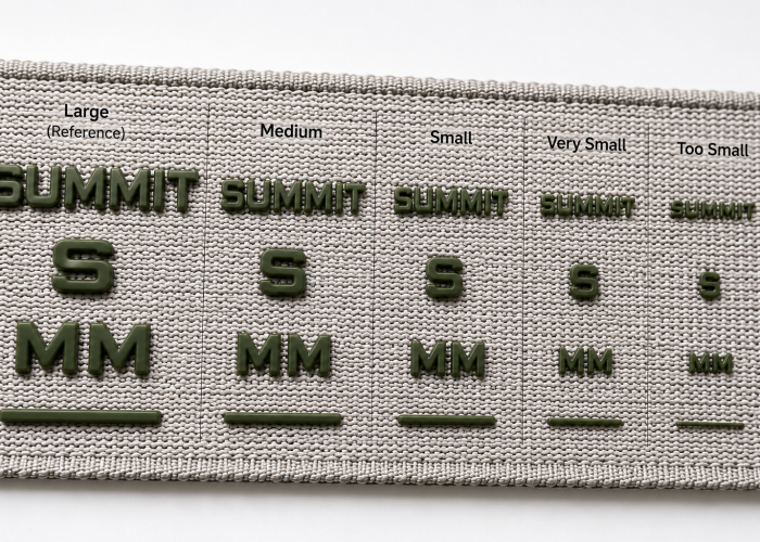
Small text becomes difficult to silicone print when the strokes, spaces between letters, or openings inside your letters become too fine at the final printed size—not simply when your font reaches a particular point size. Two fonts at the same size can therefore give you very different printing results.
Your brand name may look perfectly readable in the artwork while one small feature is already creating a problem on the webbing. The main strokes might remain clear, for example, while the opening inside an A, B, R, or similar letter starts closing. A thin typeface can also create much finer strokes than a heavier typeface at the same text height. Or your individual letters may print clearly but begin to merge because the spacing between them is too tight. Font size tells you how large your text is; it does not tell you how printable the features inside it are.
This matters even more when your logo has to fit narrow webbing. Reducing the complete artwork also reduces the text strokes, internal openings, and spacing. Your main logo shape may still look acceptable while the small wording becomes the first part that loses readability.
If the logo on your webbing sample looks clear but the text does not, adjust the text before redesigning the whole logo. If letters are merging, open the spacing. If internal openings are closing, give those areas more room. If thin strokes are disappearing, consider a heavier treatment. And if secondary wording is creating the problem, decide whether it really needs to remain in the smallest logo version. If your brand-required text cannot change and the webbing gives you no room to enlarge it, that is when another branding method becomes a more practical option.
Let’s identify which line, gap, or text feature is limiting the result before you redesign the whole logo.
Yes, outline and hollow logos can work on silicone-printed webbing, but they become difficult when your design depends on a thin border and a small internal opening both staying clear. The printed outline and the empty space inside it create two different requirements that need to work together.
Your logo may have a clean silicone border surrounding an unprinted centre. If that border becomes too fine at the final print size, parts of the outline can lose definition. But simply making it thicker is not always the answer. A heavier border takes up more space around the hollow area, so a small internal opening can become narrower or partially close even while the outside of your logo still looks correct.
This is why “make the outline thicker” should not be an automatic correction. Look at your webbing sample and identify which part is actually changing. If the outside border looks weak or uneven while the hollow area remains clear, the outline may need more width. If the outline looks good but the internal opening is closing, that opening needs more room instead. Changing both unnecessarily may alter more of your approved artwork than the problem requires.
If both the outline and internal space remain inconsistent across your webbing samples, the design may simply have too little room at that printed size. In that case, compare a simplified or solid version before changing the webbing itself. Preserve the parts of your logo that already work and adjust the feature that is actually limiting the result.
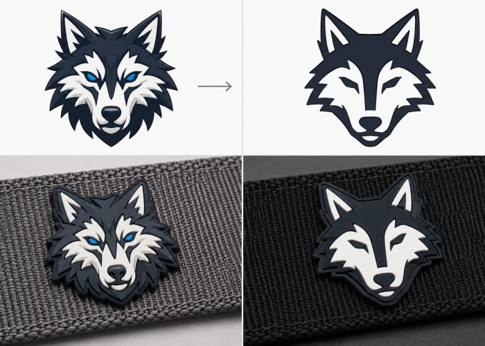
Yes. Multi-color silicone logos can print clearly on webbing, and webbing width alone does not determine the maximum number of colors. The real limitation is whether the color areas and boundaries in your final-size logo can be reproduced and aligned consistently with the available printing process.
On 15–20 mm webbing, the available print area may force your logo smaller. A three-color design with several small color areas can then end up with smaller elements and tighter boundaries between colors. On 30–40 mm webbing, the same artwork may have more room to keep those elements larger and better separated. The wider webbing does not technically allow more colors by itself—it simply gives a detailed multi-color logo more space to work with.
This is why more colors do not automatically make your silicone logo more difficult. A four-color logo with large, separated color areas may be easier to reproduce than a two-color logo containing several small elements that must meet precisely edge-to-edge. What matters is how much room those color boundaries have for small registration variation once your logo is scaled to fit the actual webbing.
If your multi-color webbing samples show visible gaps or overlaps, look at where the problem occurs before removing a color. If one small color area or tight boundary repeatedly varies while the rest of your logo stays consistent, give that feature more space where your branding allows. If several important color boundaries become too tight once the artwork fits your webbing, simplifying the color layout may be more practical. If those boundaries are essential to your brand and cannot be changed, compare another branding method rather than forcing the original artwork into a size where it cannot reproduce consistently.
The problem may be one tight color boundary or the final logo size—not simply the number of colors.
Webbing texture can limit a silicone logo when pronounced surface variation makes its smallest edges, lines, or openings harder to reproduce consistently. This does not mean a textured webbing is unsuitable for silicone printing—the larger and simpler parts of your logo may still print well.
You may see this clearly on your webbing sample. A large solid part of your silicone logo looks clean, while a thin outline becomes slightly uneven or a small internal opening loses definition. If the same artwork looks clearer on a smoother webbing, the difference may come partly from how the printing surface interacts with that fine feature. Different webbing constructions can produce different print results even when they use the same fibre material; commercial webbing-printing guidance similarly distinguishes coarse constructions that lose fine graphic detail from smoother constructions that reproduce more detail.
This is why one failed detail does not mean your webbing is wrong for the whole logo. If the solid areas and larger features already look good, identify the smallest feature that changes across your samples. The surface may be giving that particular detail too little margin, while the rest of your design remains perfectly workable. The supplier should still confirm whether the printing setup can be improved before you conclude that texture itself is the cause.
If your textured webbing was chosen for its hand feel, appearance, strength, or another product requirement, keep that requirement in place while you work on the problem feature first. Strengthen a weak outline, open a small gap, or simplify a secondary detail where your branding allows. If several essential details still cannot reproduce consistently on the webbing you need, then compare a simpler logo construction or another branding method before changing a webbing that is already doing its functional job.
Webbing width limits your silicone logo when fitting the artwork into the available print area and makes its lines, gaps, text, or color areas too small to reproduce clearly. Narrow webbing does not automatically make silicone printing more difficult; the problem starts when your logo has to shrink with it.
Suppose your logo is approved on 40 mm webbing, but you also need it on 20 mm webbing. If you reduce the complete artwork by 50% to fit the narrower webbing, every feature becomes 50% smaller too. A 1.0 mm line becomes 0.5 mm, a 1.0 mm internal gap becomes 0.5 mm, and your small text and color details shrink at the same time. The logo still looks perfectly proportional on screen, but the features that were comfortable at the larger size can now become the parts that limit the printed result. In practice, webbing printers may require artwork/templates to be prepared for each specific webbing width rather than treating one graphic as universally scalable.
So if your 20 mm webbing sample loses a small tagline or internal opening while the main brand mark still looks good, you don’t necessarily need to change the whole logo. The narrower version may simply need different production artwork. You could strengthen the affected line, open a critical gap, enlarge important text, or remove a secondary detail while keeping the main brand identity unchanged.
If your logo will be used across several webbing widths, review each version at its actual printed size rather than approving the largest version and scaling it automatically. If your brand requires every feature to remain identical and the narrower webbing gives you no room to keep those details large enough, then you have reached a real trade-off: change the logo layout, change the available print area where the product allows it, or compare another branding method. A logo approved on 40 mm webbing does not automatically approve its 50%-scaled version for 20 mm webbing.
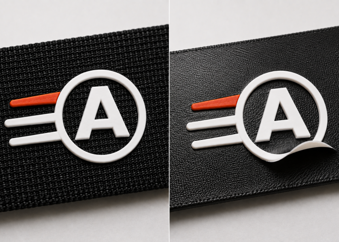
Silicone logos can crack or peel on webbing because of poor adhesion, unsuitable silicone-to-webbing compatibility, incorrect curing, or movement that the finished print cannot tolerate. Logo geometry can contribute when failure repeatedly concentrates at a particular feature, but the logo design should not be blamed before the broader print remains stable.
If the silicone on your webbing sample starts failing, look at where the failure appears. If thin lines, letters, and large solid areas are all lifting from the webbing, simplifying your detailed logo is unlikely to solve the main problem. The supplier should first investigate the silicone system, curing, webbing surface, and adhesion. Silicone textile inks can provide high elongation and strong textile adhesion when the ink system, processing, and substrate are compatible.
The diagnosis changes if most of your logo remains firmly bonded but the same individual feature repeatedly fails after the webbing bends or stretches. That does not prove the geometry is responsible, but it gives your supplier a much more specific area to evaluate. The useful evidence is not simply that “the logo peeled”; it is whether the failure is widespread or consistently concentrated in one part of the design.
If your webbing sample has a durability problem, don’t redesign the logo first. Check the failure pattern. Widespread lifting points you toward printing or webbing compatibility first; a repeated local failure gives you a reason to investigate that feature and its use condition. Adjust the artwork only when the rest of the print is stable and there is evidence that the specific feature is contributing to the failure.
Let’s check what needs adjusting before you scale the same artwork into production.
Change your logo when a specific design feature is causing the problem and your branding allows that feature to move; consider another branding method when the features you must preserve cannot be reproduced consistently on the webbing you need. If the whole print has an adhesion or durability problem, however, investigate that first rather than changing either one.
Suppose the silicone logo on your webbing looks good except for one closing gap, small text area, thin outline, or tight color boundary. Most of your design is already working. Instead of simplifying the complete logo, adjust that limiting feature first and compare the revised samples. This preserves the branding decisions that have already passed while giving the problem feature more room to reproduce consistently.
The decision becomes different when that feature is fixed by your brand. Your small lettering may have to remain, an outline may not be allowed to become solid, or several color areas may need to keep their original relationship. If those essential features still cannot reproduce consistently after your supplier has confirmed a suitable silicone-printing setup on the actual webbing, continuing to simplify the artwork eventually means you are changing the brand to suit the process.
Use the requirements that are already fixed to decide what should change next. If your webbing meets the product requirements and one adjustable logo feature is limiting the result, change that feature. If the logo must remain unchanged and silicone printing cannot reproduce its essential features consistently, compare another branding method. If the whole print is cracking or peeling, investigate the printing and webbing compatibility first. And if your webbing was selected for stretch, strength, hand feel, or another important function, don’t replace it just to make the logo easier to produce.
Thin lines, narrow gaps, small text, hollow details, and tight multi-color boundaries can all make silicone printing more difficult on webbing. But the right solution depends on which feature is failing and how it interacts with your actual webbing.
If your silicone logo is already causing problems during sampling, send us your artwork and webbing requirements. We can help identify the limiting feature before you simplify the whole logo, change the webbing, or switch branding methods.
We will contact you within 1 working day, please pay attention to the email with the suffix “@anmyda.com”.