
Small logo details can look clear in the artwork but become blurry, heavier, or partially filled when screen printed on webbing. A logo can even look acceptable on one sample without proving that its fine details will reproduce consistently.
Small details lose clarity when the required lines, gaps, or text cannot be reproduced consistently by the combination of the actual webbing surface and printing process. Overall logo size alone does not define printability—the smallest critical features and how consistently they can be reproduced matter more.
Read on to learn what limits fine-detail clarity, how webbing material, texture, and stretch affect the result, and when a screen-printed logo has enough manufacturing margin for production.

Webbing manufacturing expert with 15+ years of experience helping product developers build high-performance straps for industrial, medical, and outdoor use.
Small details blur when the printing process cannot reproduce the logo’s smallest lines, gaps, or text cleanly on the actual webbing surface. The overall logo can be large enough while one small feature is already close to what that webbing and printing process can reproduce consistently.
A 35 mm-wide logo may contain a small letter with a narrow internal opening. If that printed feature becomes slightly heavier than the artwork, the outside shape may still look acceptable while the opening becomes narrower or partially closes. A simpler 20 mm logo with wider spacing could therefore print more clearly than the larger, more detailed design. Overall logo size alone does not tell you which design is easier to print.
The webbing surface changes how much margin those fine features have. A smoother, more uniform surface generally gives better conditions for fine-detail reproduction than a rougher or more open surface. But texture is not the only factor. The printing process also affects how accurately those features reproduce, which is why one universal minimum line or gap size should not be applied to every webbing.
If your logo loses clarity, identify which feature is changing before redesigning the whole logo. Compare the smallest important lines, gaps, and text with the artwork. If the overall logo looks right but one internal gap repeatedly closes, increasing that gap or simplifying that feature may preserve the approved logo size while giving the print more manufacturing margin.
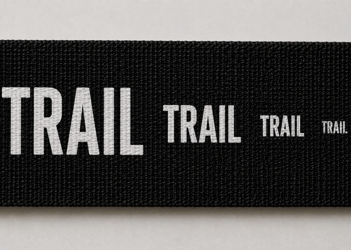
Printing adjustments can improve unclear logo details when the current printing setup is limiting the result, but they cannot make every fine feature reliable on every webbing. What matters is whether the adjustment produces a clear result consistently without compromising another approved requirement.
You may receive a first sample where one small letter is partly filled while the rest of the logo looks correct. It is reasonable for the supplier to adjust the printing and make another sample. If several revised pieces reproduce that opening clearly and consistently, the design has more manufacturing margin than the first sample suggested. If one piece looks excellent while others still show heavier lines or narrowing gaps, the underlying risk has not disappeared just because a cleaner sample was produced.
A clearer detail is only an improvement if the rest of the approved print stays acceptable. If the revised sample opens the small gap but changes the logo coverage, colour appearance, or another required result, the supplier has shifted the problem rather than fully solved it. The goal is not to maximise one fine detail; it is to reproduce the complete approved logo reliably.
If your supplier says “we can adjust the printing,” focus on the revised result rather than how every process setting was changed. Compare several pieces on the actual webbing and look again at the feature that failed originally. If it becomes consistently clear while the other approved requirements remain intact, keep the design. If it remains borderline, give that feature more space, simplify it, or reconsider the printing method rather than repeatedly chasing one perfect sample.
A cleaner sample only helps if the same fine details can be reproduced consistently.
Webbing texture affects small printed details because a rougher or more open printing surface gives fine lines and gaps less margin to reproduce cleanly than a smoother, more uniform surface. A detail that works on one webbing construction should therefore not automatically be approved for another.
Two polyester webbings can have the same width and similar thickness but very different printing faces. One may have a tight, relatively smooth surface, while another shows more pronounced yarn texture or a more open structure. A small internal gap that stays clearly separated on the first webbing may look less even or partially close on the second, even though both are still specified as polyester webbing.
This is why a previous printing approval belongs to the webbing construction as well as the logo. If you move the same artwork to a new webbing, compare the smallest critical features rather than assuming the old result will transfer. If those features become less consistent on the new surface, texture may be reducing the available printing margin. But don’t blame texture automatically—the printing process and how the ink interacts with that particular surface also affect the result.
If the textured webbing is required for its appearance, hand feel, strength, or another product function, don’t replace it just to rescue one fine logo detail. First see whether the supplier can reproduce that feature consistently on the required construction. If not, opening the critical gap or simplifying that feature may preserve the webbing you actually need. Only reconsider the webbing or branding method when the required detail and required surface cannot produce a repeatable result together.
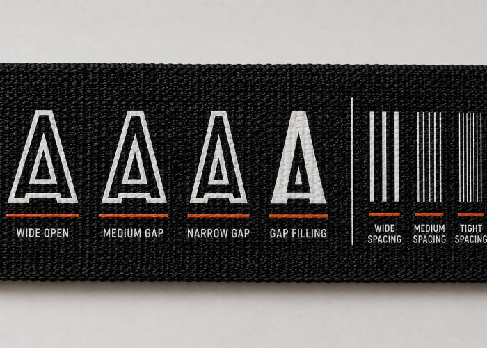
Polyester or nylon alone does not determine which webbing will hold finer screen-printed details. The actual construction, surface finish, and compatibility with the printing system can matter more than the fibre name alone.
You may compare a smooth polyester webbing with a more textured nylon webbing and see a sharper logo on the polyester. That does not prove that polyester inherently holds finer detail than nylon because the comparison has changed both the fibre and the printing surface. Even webbings made from the same fibre can reproduce fine details differently when their surface structure or finish changes. Polyester and nylon also bring different printing considerations, so neither should be treated as universally easier for every logo or ink system.
The useful question is therefore not simply “Should I use polyester or nylon for a sharper logo?” Compare the actual constructions you are considering. If the nylon option gives poorer detail than your polyester reference, determine whether the critical feature improves on another suitable nylon construction before blaming the fibre itself. The same logic works in reverse.
Choose the fibre around the performance the webbing actually needs first. If nylon or polyester was selected for strength, hand feel, stretch behaviour, outdoor performance, or another functional requirement, don’t change that material solely because one fine logo feature is difficult to reproduce. First see whether the required feature can be given more printing margin or whether another branding method is more suitable. Otherwise, you may solve a small logo problem by changing a webbing requirement that matters much more to the finished product.
Let’s check whether the material is really causing the problem before you change a working specification.
Small printed details distort on elastic webbing because stretching changes the dimensions of the surface carrying the logo. Fine gaps, letters, and shapes can therefore change visually even when the printed ink remains intact.
A logo may look sharp when the elastic webbing is relaxed but look different once the strap reaches its normal working stretch. A narrow opening inside a letter can become wider or change proportion, while closely spaced elements can move farther apart. The important distinction is that the logo can remain firmly attached and uncracked while its fine details no longer match the intended appearance. That is a visual-design problem under stretch, not automatically an ink failure.
The opposite situation points somewhere else. If the logo shape changes with the webbing but returns acceptably when relaxed, the print may simply be following the elastic construction. If the ink cracks, splits, or separates at the required working stretch, printing compatibility needs attention instead. Stretch-capable textile inks exist specifically to improve flexibility, so elastic webbing itself does not mean screen printing will automatically fail.
When reviewing an elastic-webbing logo, define how much the strap actually stretches in the application and judge the critical details at that condition. If the print remains intact but one small feature becomes unreadable, giving that feature more spacing or simplifying it may be more useful than changing the ink. If the print itself fails, let the supplier address the printing solution first. Don’t redesign the artwork until you know which requirement is actually failing.
Logo detail becomes inconsistent when piece-to-piece or run-to-run variation is large enough to affect a feature that already has very little printing margin. The smallest critical feature can therefore show variation while the larger parts of the same logo still look acceptable.
Consider a small opening that is only just reproducing clearly in the approved design. Across several printed pieces, that opening may remain clear on one, look narrower on another, and become partly filled on another, while the larger letters appear almost unchanged. This is why fine details need more than a single successful result: screen and stencil characteristics affect both detail reproduction and ink deposit, so features close to the achievable limit are more sensitive to process variation.
One excellent sample and one repeatable design are not the same thing. If several comparable pieces reproduce the smallest important feature similarly, that gives stronger evidence that the design has useful manufacturing margin. If that same feature varies noticeably while the rest of the logo remains stable, making the visual tolerance stricter does not create more margin—it only makes the existing limitation harder to accept.
Before changing the whole logo, identify the feature that is actually varying. If possible, give that line, gap, or small text more room while preserving the overall branding. If the feature cannot be changed because it is brand-critical, ask the supplier whether it can be reproduced consistently on the required webbing. If not, reconsider the printing method rather than approving one unusually clean sample and expecting every production piece to match it.
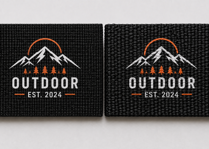
Consider another printing method when the important fine details in your logo still cannot be reproduced consistently on the webbing you need, and simplifying those details would change the design too much. Small details alone are not a reason to give up screen printing.
You may already have widened a narrow gap or simplified some small text, while the supplier has also adjusted the printing. Most of the logo now looks good, but one important feature is still clear on some samples and partly filled on others. At this point, asking for another “better sample” may not move the project forward. The more useful question is whether screen printing can reproduce that feature reliably enough for production.
Before changing methods, also look at what you would be trading. Another branding method may reproduce the fine detail more clearly, but it may also change the logo’s appearance, hand feel, stretch behaviour, adhesion, durability, or cost. A sharper logo is not automatically a better result if you lose something else the product needs.
If the fine detail cannot be simplified, ask the supplier to compare a suitable alternative on the same webbing. Judge both results against the complete requirement, not clarity alone. Change methods when the alternative preserves the important logo detail while still meeting the product requirements that matter. Otherwise, you may solve the smallest feature in the artwork and create a bigger problem elsewhere.
That variation may matter more than the best sample when deciding whether the logo is ready for production.
When reviewing screen-printed webbing, start with the smallest important details in the logo and compare them across several pieces—not just whether the overall logo looks good. Fine lines, narrow gaps, and small letters are the features most likely to show when the design is getting close to what the webbing and printing process can reproduce reliably.
Place the approved artwork beside the printed webbing. The overall logo may look correct while a small opening has become narrower, two nearby elements are starting to merge, or small lettering looks heavier than intended. Then check that same feature across several pieces. If it stays similarly clear, you have better evidence that the result is repeatable. If one piece is sharp while another is already borderline, don’t let the best sample become your only reference.
For elastic webbing, check the logo at the working stretch your product actually requires as well. If the print stays intact but a small detail becomes unacceptable when stretched, you have a visual-performance issue. If the print cracks, lifts, or separates, that points to a different printing problem. These two failures should not automatically lead to the same change.
Your review can therefore stay simple: Is the important detail clear? Is it consistent across the samples? Does it remain acceptable in the actual use condition? If one answer is no, don’t immediately change the whole logo, webbing, or printing method. First identify what failed. A clarity problem, a repeatability problem, and a stretch-related problem may need different solutions.
Fine logo details do not become reliable simply because one screen-printed sample looks good. What matters is whether the smallest important lines, gaps, and text have enough margin to stay clear across the actual webbing, production samples, and required use conditions.
If your logo is already losing detail during sampling, send us the artwork and webbing requirements. We can help evaluate what should change before you redesign the whole logo or switch printing methods.
We will contact you within 1 working day, please pay attention to the email with the suffix “@anmyda.com”.