Integrating consistent branding across medical equipment enhances facility recognition while reinforcing professional identity. For product developers and healthcare administrators, aligning medical straps with established brand colors requires balancing marketing objectives with critical patient safety considerations.
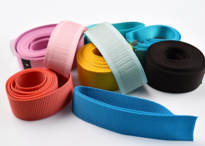
Yes, medical strap colors can be matched to facility branding through custom manufacturing processes that deliver precise Pantone color matching. Custom-colored straps allow healthcare facilities to extend their visual identity across equipment while maintaining regulatory compliance. Manufacturers can produce medical-grade webbing in specific brand colors through specialized dyeing techniques that ensure colorfastness while preserving material integrity and performance characteristics.
Learn how to design brand-matched medical straps with optimal colors for visibility, safety, and recognition across clinical environments.

Webbing manufacturing expert with 15+ years of experience helping product developers build high-performance straps for industrial, medical, and outdoor use.
Medical strap colors can be matched to your facility’s branding through custom manufacturing services that provide precise Pantone color matching and color consistency verification. Webbing manufacturers can produce straps in specific brand colors while maintaining the performance characteristics required for medical applications.
What we’ll need from you:
Material options affect color quality
Material Type Colorfastness Best Applications Key Advantages
Polyester Superior High-sanitization environments Excellent chemical and UV resistance
Nylon Good Flexible, load-bearing uses Better elasticity and strength
Solution-dyed Excellent Outdoor or frequent cleaning Color throughout fiber, not surface
Piece-dyed Very good Precise brand matching Widest color selection range
Our quality verification process:
Our custom color development typically requires 2-3 weeks, with minimum order quantities starting at 1,000 yards for most medical-grade webbing. Custom color matching services generally add 15-20% to standard material costs but create a seamless extension of your facility’s visual identity across all patient touchpoints.
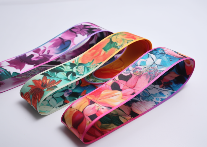
Custom medical straps can incorporate facility logos, department names, contact information, and instructional text through advanced printing, weaving, and embossing techniques. Beyond color matching, these additional branding elements create a comprehensive identity system that enhances facility recognition while potentially improving functionality through clear visual communication.
Key branding possibilities:
Direct printing offers the most versatile option for reproducing complex logos and text on medical straps. Modern digital printing achieves up to 1200 dpi resolution with excellent durability when combined with protective clear coats. This method excels on polyester webbing due to its smooth surface and compatibility with UV-cured inks.
Jacquard weaving creates highly durable branding elements woven directly into the strap structure. This premium technique incorporates contrasting threads that become an integral part of the webbing construction, making them ideal for high-wear applications. Most manufacturers offer 2-6 colors with minimum feature sizes of approximately 2mm.
Embossing and debossing create tactile branding elements that provide both visual and tactile identification, particularly valuable in low-visibility situations. When combined with contrasting colors, these elements enhance brand visibility while potentially adding functional benefits such as improved grip.
For medical environments requiring frequent sanitation, heat-transfer branding provides excellent chemical resistance by bonding specialized inks to the webbing surface at high temperatures. This process creates a durable imprint that withstands repeated exposure to cleaning agents while maintaining excellent brand representation.
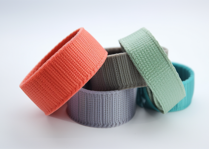
The choice of medical strap color directly impacts patient safety by influencing visibility, identification speed, and error reduction in clinical settings. Color selection affects how quickly medical personnel can locate and deploy straps in emergency situations, potentially impacting critical treatment timeframes.
Key safety impacts:
High-visibility colors such as bright blue, yellow, and neon green significantly improve detection speed in emergency situations, reducing location time by 28-35% compared to standard colors. Color-coding systems enhance operational efficiency by allowing staff to instantly recognize the appropriate equipment for each department, minimizing errors and streamlining workflow during patient transfers.
Environmental factors like hospital lighting conditions dramatically alter color perception, with colors like yellow and orange maintaining the most consistent visibility across various settings. Patient demographics should guide selection, as facilities serving elderly populations benefit from high-contrast colors visible despite age-related vision changes, while pediatric facilities often use bright, engaging colors that reduce anxiety while maintaining visibility.
Custom colors can significantly impact medical strap visibility depending on environmental conditions, patient characteristics, and specific clinical applications. The visibility effects of color choices must be carefully evaluated to balance branding preferences with critical safety requirements.
Visibility performance by color category:
High-visibility colors maximize detection speed by utilizing the eye’s heightened sensitivity to specific wavelengths, creating neurological responses that draw attention more rapidly than muted tones. Medium-range colors offer moderate visibility while often aligning better with established branding but vary significantly in effectiveness based on shade and saturation. Dark colors significantly reduce visibility in most environments and should be limited to non-critical applications or supplemented with high-visibility accents.
Contrast ratios between strap colors and typical backgrounds directly impact visibility, with ratios of at least 3:1 against common hospital surfaces ensuring adequate visibility under normal conditions, while critical emergency equipment should aim for 4.5:1 or greater for maximum safety.
Medical strap color visibility varies significantly across different skin tones, requiring thoughtful selection to ensure universal detection and proper placement. Colors that provide strong contrast against all skin tones enhance proper application and reduce potential complications during medical procedures.
Best performing colors by skin tone:
Fluorescent yellow provides the most consistent visibility across all skin tones, maintaining a minimum 3:1 contrast ratio across the full Fitzpatrick scale (I-VI). Bright orange delivers excellent visibility for all but the palest skin tones, with minimum contrast ratios of 2.8:1 against Type II skin and exceeding 4:1 for Types III-VI. Dark blues and greens create strong contrast against lighter skin but significantly decrease in visibility against darker skin, showing contrast ratios exceeding 4:1 for Types I-III but dropping to 1.5:1 or lower for Types V-VI.
Color combinations incorporating high-contrast borders provide optimal solutions, allowing bright-colored edges against contrasting center materials to achieve maximum visibility while accommodating branding preferences in the central portions of the strap.
Environmental factors including lighting conditions, background surfaces, and viewing distance significantly impact medical strap visibility. Understanding these environmental influences helps ensure straps remain readily visible across the full range of clinical scenarios.
Key environmental influences:
Lighting conditions dramatically alter color perception, with fluorescent lighting emphasizing blue and green tones while diminishing red perception compared to natural daylight. Background surface contrasts determine real-world visibility more than inherent brightness, as even bright colors can “disappear” against similarly-colored backgrounds. Distance and angle constraints affect optimal choices, with smaller straps requiring higher-contrast colors to maintain visibility.
Extended use environments require colors that maintain consistent appearance under varied conditions, particularly for straps used across multiple departments or transported between facilities, where changing environments can significantly affect perception and recognition.
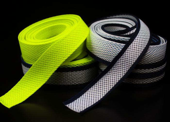
Healthcare facilities increasingly implement standardized color-coding systems for medical straps to enhance safety, improve departmental identification, and reduce procedural errors. These evolving industry practices balance visibility requirements with operational efficiency and branding considerations.
Leading color standardization approaches:
Many facilities have adopted department-specific color schemes for instant visual identification, significantly reducing cross-contamination between departments and streamlining equipment return processes. Function-based systems assign colors based on intended use rather than location, improving staff familiarity across facility transitions and reducing potential errors when working in multiple departments.
Safety-driven color standards are increasingly being implemented across healthcare networks, with several major systems mandating high-visibility yellow or orange for all critical emergency equipment regardless of department. Hybrid approaches represent the most recent trend, featuring high-visibility colors for borders while incorporating more subtle branded elements in less critical areas to satisfy both safety requirements and organizational identity.
Best practices for hospital strap color selection prioritize visibility, standardization, and functional identification while accommodating appropriate branding elements. Evidence-based approaches balance immediate safety needs with operational efficiency and organizational identity.
Implementation best practices:
Conduct environment-specific visibility testing under actual use conditions and develop a comprehensive color-coding system documented in facility policies with specific Pantone references and application guidelines. Prioritize visibility for critical emergency equipment above all other considerations, using only proven high-visibility colors regardless of branding preferences.
Balance branding needs through strategic design rather than compromise, incorporating organizational identity through specific placement of logos in non-critical areas rather than altering safety-optimized colors. Implement staff training programs addressing color-coding systems to ensure all personnel understand the meaning behind designations and recognize safety implications, incorporating this education into orientation and continuing education.
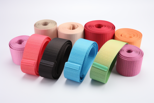
Selecting the right medical strap colors balances facility branding with critical safety considerations. Strategic color choices enhance visibility, improve efficiency, and maintain brand identity without compromising patient care. Our custom webbing manufacturing capabilities can deliver precise color-matched medical straps with optimal visibility properties while maintaining performance standards required for healthcare applications.
Critical factors for medical strap color selection include visibility across various lighting conditions, contrast against different skin tones, alignment with color-coding systems, and brand compatibility. Environmental conditions, clinical application, and user demographics should determine the priority ranking of these considerations.
Yes, medical strap color directly impacts response speed, with high-visibility colors (fluorescent yellow, bright orange) reducing location time by up to 35% in emergency situations. This improved visibility allows medical personnel to identify and deploy critical equipment more quickly during time-sensitive procedures.
Medical strap complications can be minimized through high-visibility colors ensuring proper placement, consistent color-coding preventing misidentification, and clear visual differentiation between similar equipment types. These visual safeguards reduce application errors and improve procedural safety.
The most common branded strap considerations include maintaining minimum visibility thresholds, ensuring consistent color reproduction across production batches, and balancing brand identity with department-specific color-coding requirements. Material selection must also accommodate both brand color requirements and performance needs.
In emergency situations, colored strap visibility directly impacts patient outcomes by reducing equipment location time and ensuring correct identification of appropriate tools. Testing shows that optimized color selection can improve critical response time by 15-20 seconds, potentially decisive in life-threatening scenarios.
Different medical environments benefit from specialized color selections based on lighting, surfaces, and clinical needs. Operating rooms benefit from blue-green contrasting colors, emergency departments from fluorescent yellow/orange, and patient rooms from colors providing contrast against white bedding and walls.