
Product developers usually only see this after the first sample. The logo looks sharp when relaxed, and still acceptable under light stretch. But once the strap or waistband is used, it starts looking wider, softer, sometimes uneven. By then, it’s already a material decision showing up.
Elastic webbing changes jacquard logos by stretching their shape—logos become wider, lose sharpness, and repeated use can prevent full recovery.
In our sampling stage, we usually flag this when stretch is underestimated. Light testing won’t show it, but real use will. Read on to see when distortion starts and how to decide early if elastic webbing fits your logo.
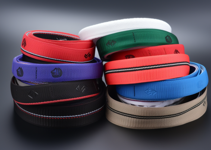

Webbing manufacturing expert with 15+ years of experience helping product developers build high-performance straps for industrial, medical, and outdoor use.
Yes—it does, and the change usually shows up after approval, not before.
In our sampling stage, we usually stretch elastic just enough to demonstrate flexibility, not real working tension. The logo still looks acceptable, so approval moves forward. Production runs, product assembles, and only when the strap or waistband is actually used does the issue appear. The logo becomes wider, flatter, and edges start losing sharpness. Most failures we see happen at this stage—when real tension and repeated use expose what sampling didn’t.
This looks acceptable on the sample table, but fails when the product is worn under load. A common mistake is approving based on relaxed or lightly stretched samples. Once in use, especially with thin lines or tight spacing, the logo starts looking softer and uneven. At that point, it’s not a weaving problem—it’s how elastic reshapes the logo.
Before we proceed to sampling, we usually ask: what stretch will this see in real use? If that’s not defined, the sample will not reflect reality. We recommend testing at your actual working stretch—often 30–50%, or higher depending on the product—and reviewing photos or video under tension. If the logo already loses clarity at that stage, don’t approve. Either simplify the design or move to non-elastic webbing.
The logo doesn’t just get bigger—it gets reshaped, and that’s where most problems start.
When elastic webbing is pulled, it expands sideways and flattens slightly. That means your logo becomes wider and shorter at the same time. On simple logos, this might still look acceptable. But once you have thin lines, small text, or tight spacing, things start to break. Gaps close up, edges lose sharpness, and details that looked clean on the sample begin to blend together. We see this a lot on brand logos with fine outlines—the outline just disappears once the strap is under tension.
What usually happens is this: the sample looks clean on the table, maybe even after a light stretch by hand. So it gets approved. Then the product goes into use—waistbands, pet leashes, goggles straps—and the webbing is held under tension for longer and more consistently. That’s when the logo starts looking “off.” Not wrong enough to reject immediately, but enough to make the product feel lower quality.
Before you even sample, take a hard look at the logo itself. If there are thin strokes or tight spacing, assume they won’t survive stretch. Ask your supplier to show the logo under real tension, not just relaxed. If details are already soft at that stage, don’t try to fix it later—simplify the design first.
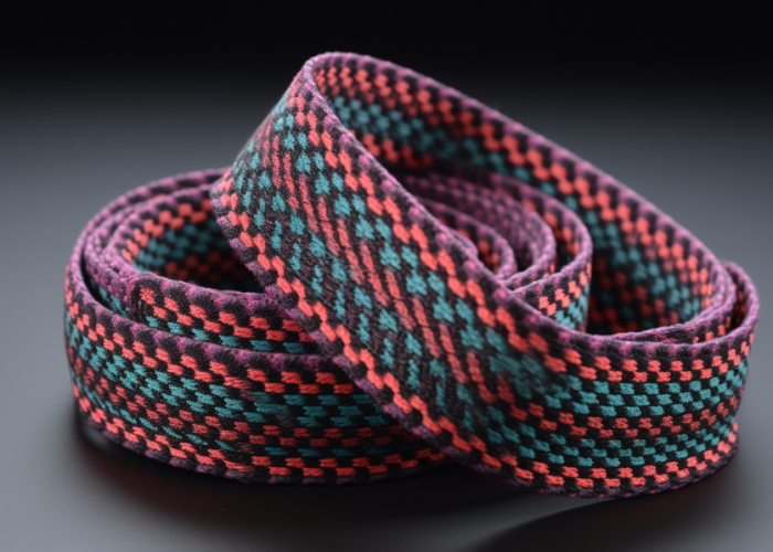
Earlier than most people expect—and usually at the exact stretch your product will use every day.
A common mistake is testing elastic by pulling it quickly with your hands and thinking “this is fine.” That’s not how the product works in reality. In actual use, the webbing sits under steady tension. Think of a waistband or a strap that’s always slightly stretched. At that level—not even extreme—the logo is already wider and the edges are no longer as crisp. You just don’t notice it until you compare it side by side with the relaxed state.
We’ve seen cases where the customer approved the sample, but once they assembled the product and wore it, the logo looked different across the whole batch. Nothing changed in production. The difference was simply that the logo was now always under load. That’s when complaints start, and by then it’s already too late.
Before approval, define what “real use” stretch actually is. Not a guess—measure it. Then test the sample at that condition and hold it there for a while, not just a quick pull. If the logo already looks softer or slightly distorted, that’s the version your customer will see every day. Decide based on that, not the relaxed sample.
Send your logo and use case. We’ll tell you if it will distort—and what to change before sampling.
There’s no clean number, but there is a point where the logo suddenly stops looking right—and most people only notice it after production.
Up to a certain stretch, the logo still feels close to the original. Then you cross a line where things change quickly. Lines lose definition, shapes feel stretched out, and spacing no longer looks balanced. It’s not a gradual decline—it drops off fast. This is especially obvious on repeating logos, where small distortion repeats again and again across the strap.
Where projects go wrong is here: elastic is chosen for comfort or function, but no one checks how far it will actually stretch during use. Softer elastic feels better, but it also stretches more—and that pushes the logo past that “acceptable” point. By the time you realize it, the product is already in production.
What we usually suggest is simple: don’t approve based on how it looks relaxed. Decide what stretch range your product will live in, then judge the logo at that point. If it only looks good when there’s no tension, that’s not a valid condition. At that stage, you either switch to firmer elastic, simplify the logo, or move to non-elastic. Otherwise, you’re approving something that will change the moment it’s used.
Not really. After repeated use, the logo comes back close—but not exactly the same.
This is where a lot of people get misled. First stretch looks fine, second stretch still fine, so it feels like it “recovers.” That’s why samples get approved. But once the product is actually used—pulled, released, pulled again—you start to see it. The edges aren’t as sharp anymore, spacing feels a bit off, the logo just looks less tight than before. Most failures we see don’t show up in the first test—they show up after some use.
Where this gets missed is during approval. The sample is checked once or twice, usually relaxed, maybe stretched a little by hand. But in real use—like waistbands or straps—it’s under tension all the time, not just momentarily. Give it a few cycles, and the difference becomes obvious, especially if you compare it to a fresh sample side by side.
If you want a real answer before production, don’t just stretch it once. Stretch and relax it 20–50 times at your working condition, then look again. If it already feels softer or slightly uneven, that’s your real result. If that version doesn’t work for your product, don’t push it through—adjust the logo or change the material now, not after production.
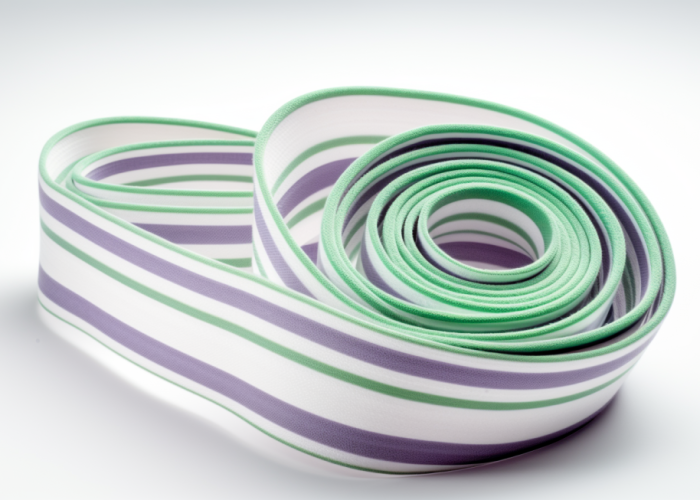
They usually start looking off as soon as the product is under normal working tension—not during sample checking.
What trips people up is how the sample is reviewed. On the table, relaxed, everything looks clean. Even a quick hand stretch still feels acceptable. So it gets approved. But once the product is actually used—worn, pulled, held under load—the logo is always slightly stretched. That’s when it starts looking wider and less sharp across the whole piece, not just in one spot.
We’ve seen full batches come back with this issue. Nothing wrong with production. Same setup, same quality. The only difference is the logo is now being seen under tension all the time. That’s when teams start questioning consistency, even though the real issue was never tested properly.
Before you approve, fix the webbing at the length it will sit in real use and look at it that way. If the logo already feels a bit soft or wider, don’t assume it’s “close enough.” That version will not improve later—it will only be more noticeable after repeated use. If it doesn’t meet your standard at that stage, don’t approve. Adjust the logo or change the material.
Yes—and in many cases, spacing is what makes the product look wrong, even when the logo itself is still readable.
When elastic stretches, the distance between repeats increases. But not always evenly. In real use, tension isn’t perfectly uniform across the whole length. Some areas stretch more than others, and over a full strap, that creates a pattern that feels uneven. You may not be able to point to a single issue, but the overall look feels off—this is where products start looking less premium.
This often gets missed because spacing is checked on short sample pieces. Everything looks aligned and controlled. But once the product is assembled and under load, especially over longer lengths, that consistency disappears.
When reviewing samples, don’t just look at the logo—look at the rhythm. Check spacing under stretch across a longer section. If the repeats already feel uneven or inconsistent, it will be worse in production. In that case, don’t tighten spacing further. Either increase the gap between logos or reduce how frequently the logo repeats. If you ignore this, the product may pass QC but still get rejected by your brand team.
If your sample looks borderline, we’ll show what’s causing it—and how to fix or avoid it fast.
Because the structure doesn’t move—so the logo stays exactly how it was woven.
With non-elastic webbing, what you approve is what the user sees. No stretch means no shape change, no spacing shift, no gradual softening over time. That’s why the same logo that looks clean on non-elastic can start looking off when moved to elastic—it’s not the weaving, it’s the movement.
But this doesn’t mean non-elastic is always the right choice. We’ve had projects where customers switched to non-elastic just to protect the logo, and then ran into another issue—the product lost flexibility or comfort, and the design no longer worked as intended.
If branding consistency is critical, non-elastic is the safer option. But if your product depends on stretch, then you need to accept the trade-off and design for it. The easiest way to decide is to test both under real use. If the elastic version already looks slightly compromised and that matters for your product positioning, don’t try to force it. Choose non-elastic. If function matters more than perfect logo appearance, then elastic is fine—but make that decision consciously, not by default.
If the webbing isn’t constantly stretched in real use, elastic can work without making the logo look obviously wrong.
The easiest way to judge this is not the sample—it’s how the product behaves when worn or used. We’ve had customers approve a clean sample, then come back after testing saying the logo “looks different.” When we check the product, it’s simply under tension all the time. That’s the difference. The logo isn’t failing—it’s just never seen in its relaxed state.
Where elastic works is when stretch is occasional, not constant. Adjustable straps, light-use gear, parts that sit loose most of the time—these don’t push the logo far enough to cause visible issues. But once the webbing stays stretched—waistbands, tight harness points—the logo is always slightly distorted, and that becomes the “normal” look.
So don’t ask “does elastic work?” Ask “how often is this stretched?”
If the answer is most of the time, treat elastic as a branding risk. If only occasional, it’s usually safe—but still check it under real use, not on the table.
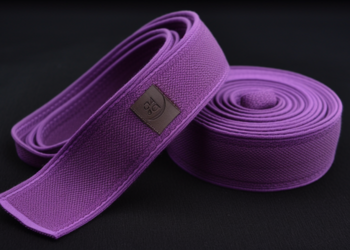
If your brand team cares about consistency across every unit, elastic will eventually become a problem.
We’ve seen this pattern more than once. Sample gets approved, production runs fine, QC passes. But once products reach the market—or even just internal review—someone lines up a few pieces and notices the logo doesn’t look exactly the same on each one. Slight width changes, small shifts in spacing. Nothing “wrong,” but not consistent either.
That’s not a production issue. That’s elastic doing what it does.
This is why elastic and precision branding don’t always go together. If your logo has fine lines, small text, or needs to look identical in all conditions, elastic introduces too much variation. You might accept it during sampling, but it shows up later when people start comparing.
A simple rule: if your product will ever be judged side-by-side—retail display, branding review, premium positioning—don’t rely on elastic to carry that logo. Use non-elastic, or move the branding elsewhere. If you skip this decision early, you won’t catch it in QC—you’ll hear it after launch.
The logo that works on elastic is usually not your original artwork—it’s a version adjusted for how the material moves.
Most issues start before sampling, not during. We regularly receive artwork with thin strokes, tight spacing, or small details. On screen, it looks clean. Even the first sample can look acceptable when relaxed. But once you stretch it to real working condition, those details don’t hold—lines start blending, small gaps close, and edges lose definition. Then the revision cycle begins.
Where teams lose time is trying to fix this after seeing a bad sample. They adjust density, yarn, or tension, hoping to “sharpen” it. But that rarely solves the root issue, because the problem isn’t production—it’s how the design reacts to stretch.
The safer approach is to adjust before sampling. Thicken key lines, open up spacing, and simplify areas that rely on precision. Not every part of your logo needs equal weight—focus on what must stay recognizable under stretch.
When reviewing samples, don’t just check relaxed appearance. Stretch it to real use level and hold it there. If any part already looks borderline—slightly merged, slightly soft—that will be more obvious in use. At that point, don’t try to push it through. Fix the design or switch material before moving forward.
This decision should be made before sampling—not after you’ve already tried to make the logo work.
Most delays we see come from locking in elastic too early. The product needs flexibility, so elastic gets chosen. Then the logo is applied, and issues start showing—distortion, spacing shifts, loss of sharpness. Instead of stepping back, teams try to fix it through multiple sample rounds. That’s where time and cost start building.
It’s easier if you decide based on use, not preference. If the product truly depends on stretch—fit, tension, comfort—then accept that the logo will change and design around it. But if stretch is not critical, choosing elastic adds unnecessary risk to your branding.
We’ve had projects where switching to non-elastic solved everything immediately—no distortion, no spacing issues, no rework. But by that stage, weeks were already lost.
The simplest way to decide is early comparison. Run the same logo on both materials and check them under real use conditions. If the elastic version already looks slightly off and that matters for your product positioning, don’t continue with it. Make the call early. Once production starts, changing direction becomes much more expensive.
Elastic changes how your logo behaves—it’s not a quality issue, it’s a material reality. Most problems don’t show in samples, they show in use. If your product relies on branding consistency, test early and decide before production. If you’re unsure, send us your logo and product use—we’ll help you check if it will hold up before you commit.
Yes—especially when products are compared side by side or worn. Individually it may look acceptable, but differences become obvious in retail display, photos, or repeated use.
To a degree. Better elastic recovers more consistently, but it doesn’t eliminate distortion. The main factor is still how much the webbing stretches in use, not just material quality.
Sometimes. Wider webbing spreads the stretch over a larger area, which can make distortion less noticeable. But it won’t fully solve issues caused by high stretch or detailed logos.
Test your logo early on both elastic and non-elastic options under real use conditions. Making the material decision upfront prevents multiple sampling rounds later.
Always testing. Visual checks alone are not enough. You need to see how the logo behaves under real stretch conditions before approving production.
Because assembly often puts the webbing under real tension. In sampling, the webbing is usually checked relaxed or lightly stretched. Once sewn into the product, it may stay stretched longer, which reveals distortion that wasn’t visible before.
We will contact you within 1 working day, please pay attention to the email with the suffix “@anmyda.com”.